From the name to storytelling to visual language, the mission was bring to life an immersive brand experience centered around a mysterious fictional hostess. Our challenge was to build a brand that felt secretive yet charismatic, nostalgic yet current.
The brief called for a brand identity that was unconventional, layered with personality, and capable of transforming every touchpoint, from the logo and visual elements to signage and communication, into part of a narrative universe. We needed to design an entire brand ecosystem that blends creative direction, emotional storytelling, and graphic design.
2025
Brand Identity
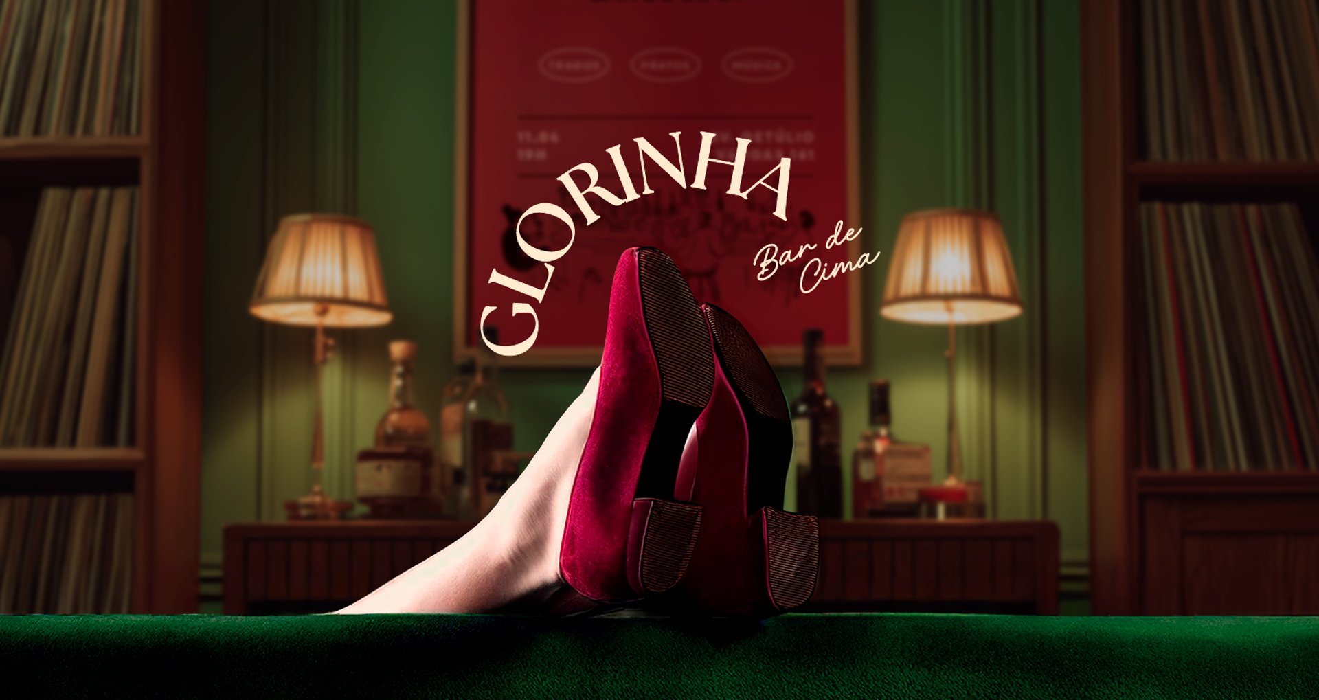
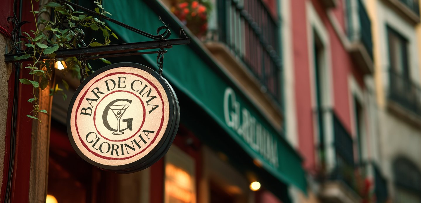
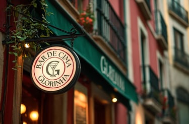
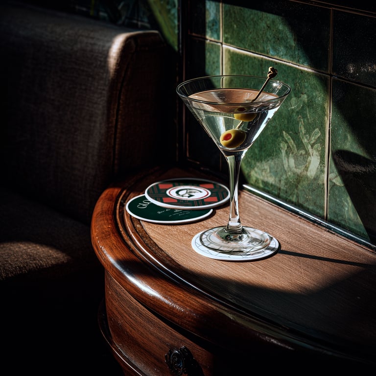
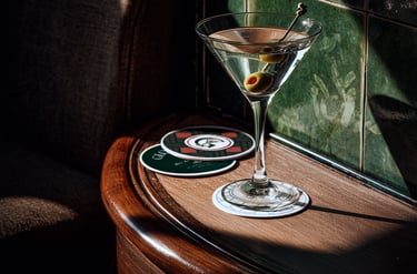
Glorinha Bar de Cima is a speakeasy-style bar located in the south of Brazil, in Santa Catarina. The bar is a concept-driven experience.
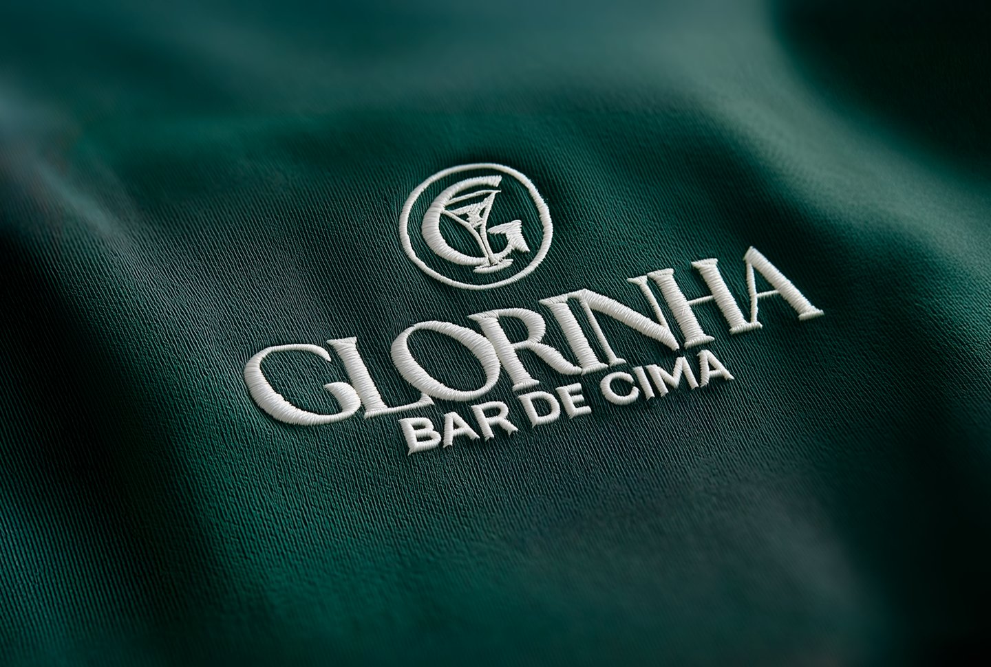
Glorinha is the soul of the brand, a ghost of glamour turned into a living experience.
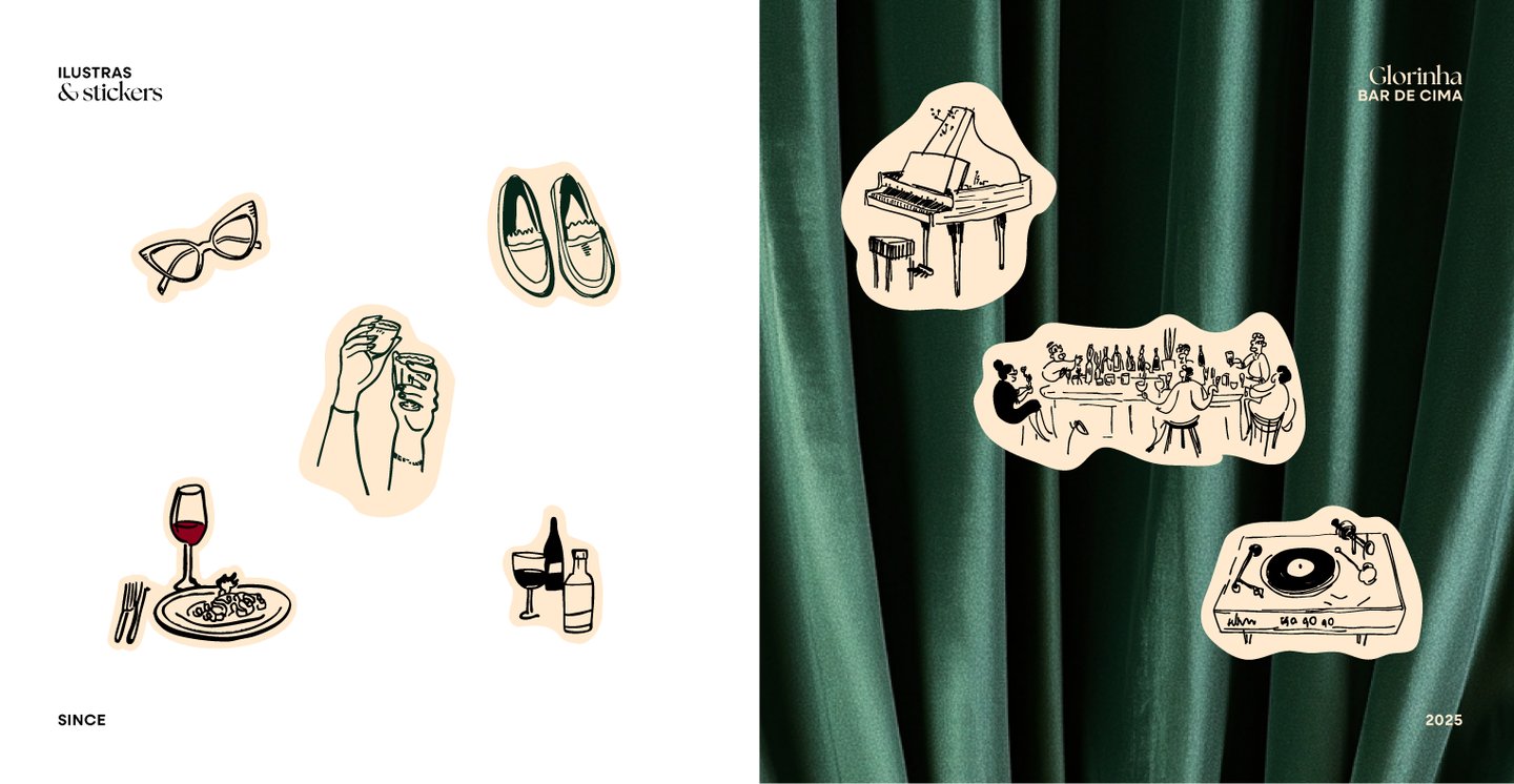
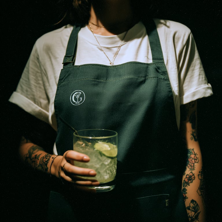
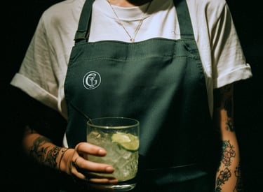
At the heart of this project lies Glorinha, a brand persona who is never seen, but always felt. A once-wealthy, free-spirited socialite who roamed the globe and partied a lot in the 70s and 80s, Glorinha now lives surrounded by faded memories of her extravagant past. The bar is imagined as her private apartment, subtly opened to guests for endless nights of music, drinks, and eclectic flavors.
Everything from interior design, drinks, music to communication style is inspired by the lingering presence of this enigmatic woman. Her presence is sensed in the decor, in the playlist, in a signature cocktail, in a handwritten note. Through her, we crafted a brand narrative full of charisma, mystery, and improvisation, one that invites people not just to visit a bar, but to take part in a story.
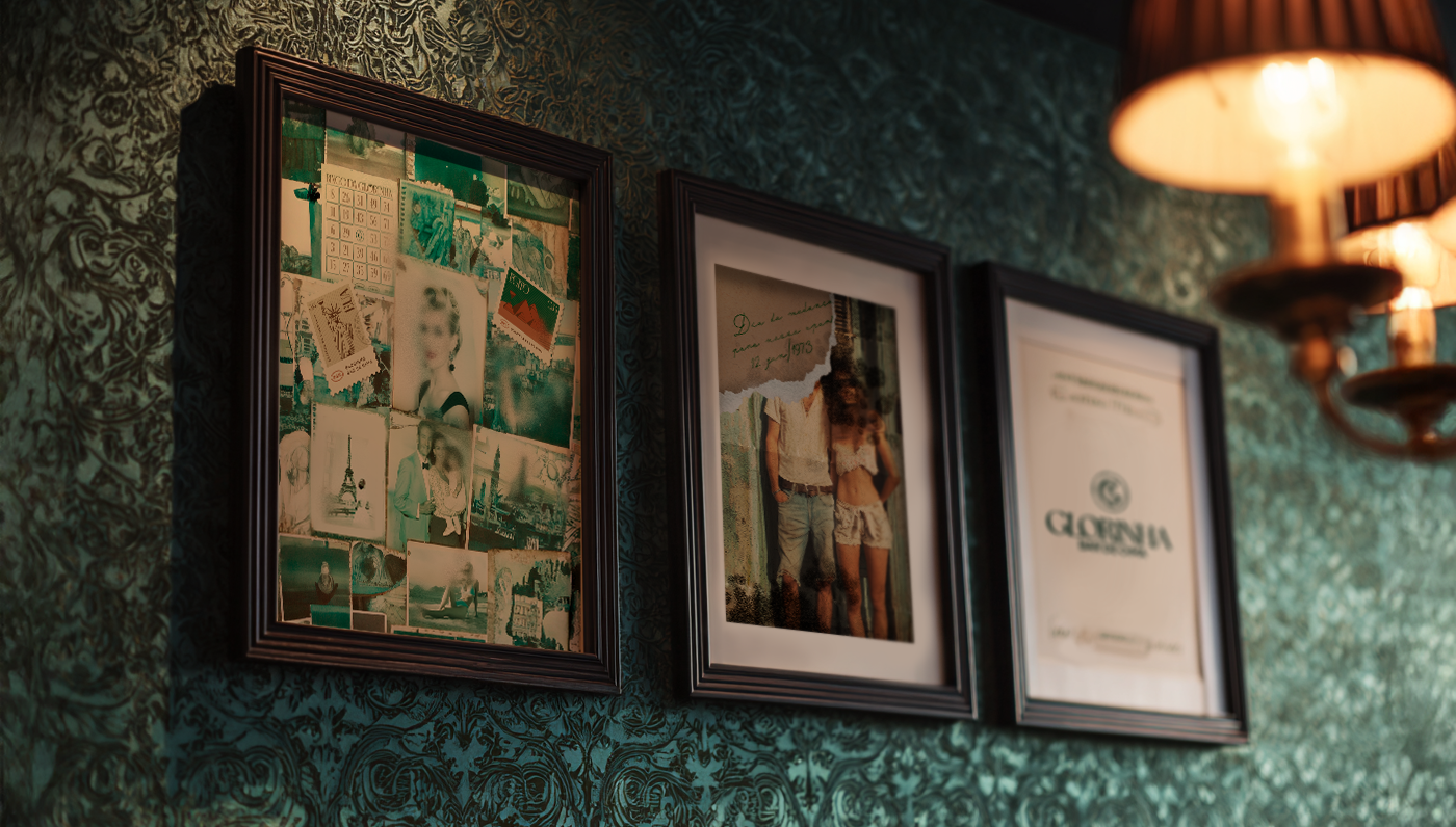
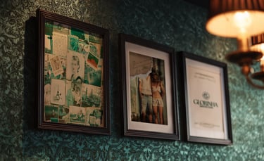
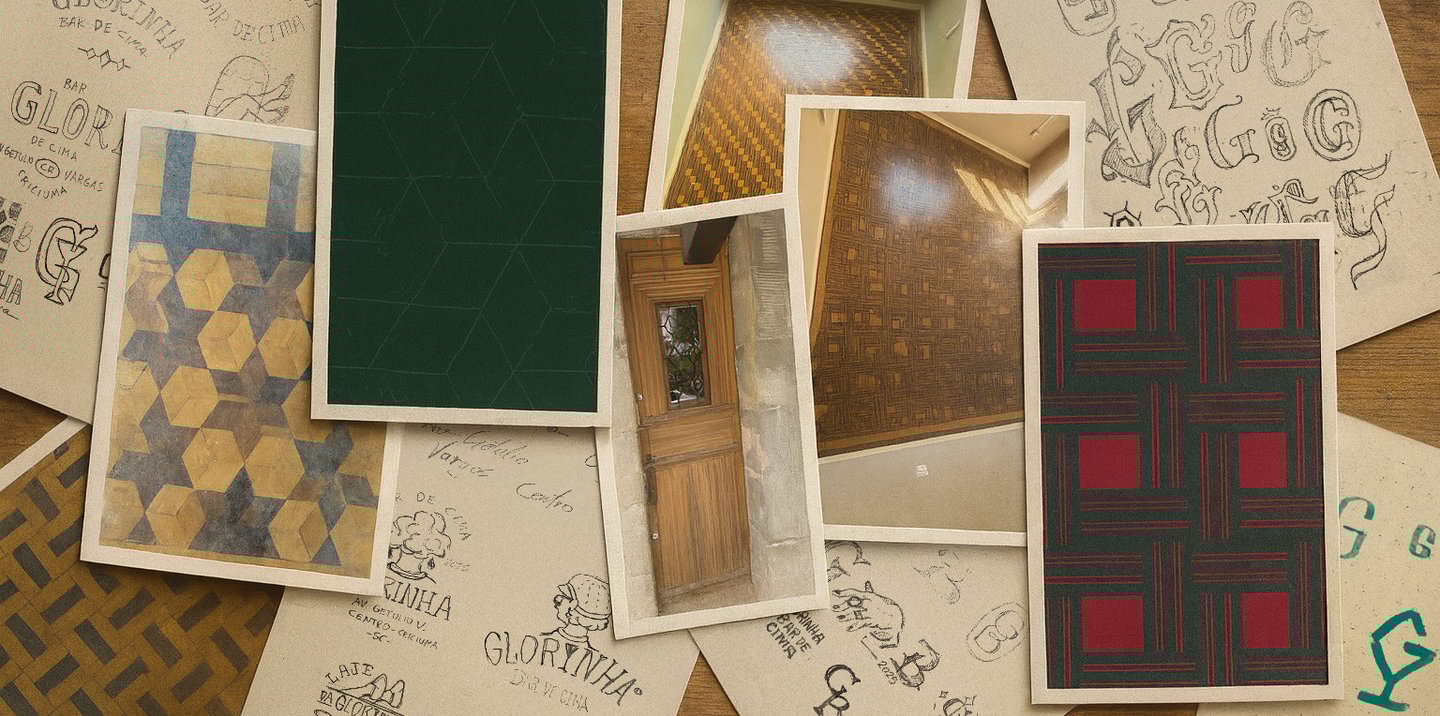
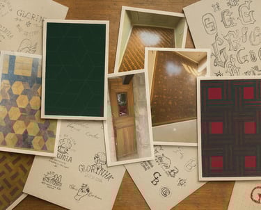
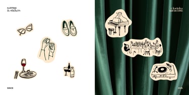
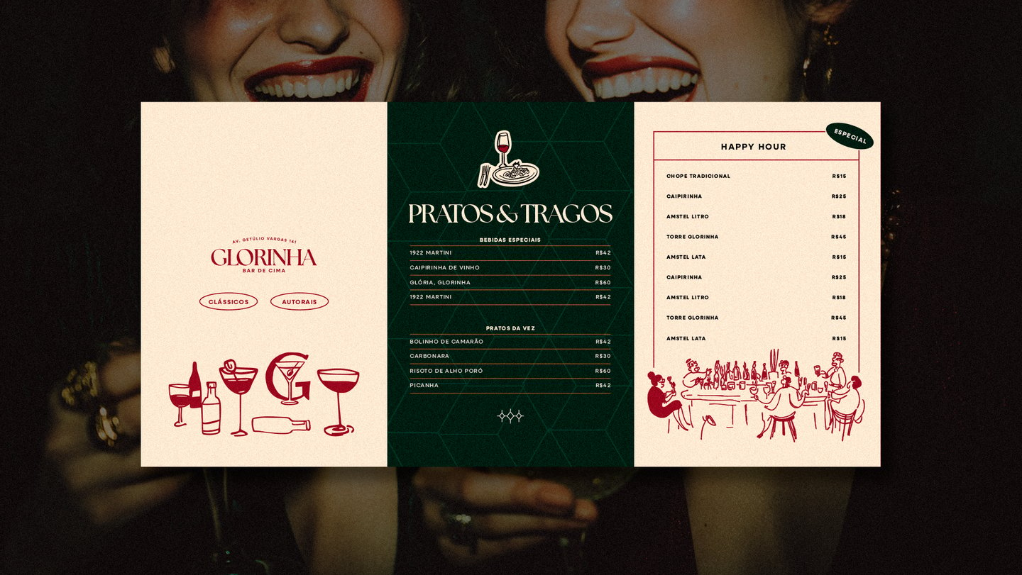
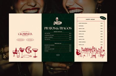

The color palette, textures, and graphic elements were not just inspired by the 70s–80s aesthetic or the speakeasy theme, they were directly extracted from real, tangible details found inside Glorinha’s actual apartment (the physical space of the bar). From vintage fabrics to faded wallpapers and forgotten trinkets, every visual cue was rooted in objects that told stories of her imagined life.
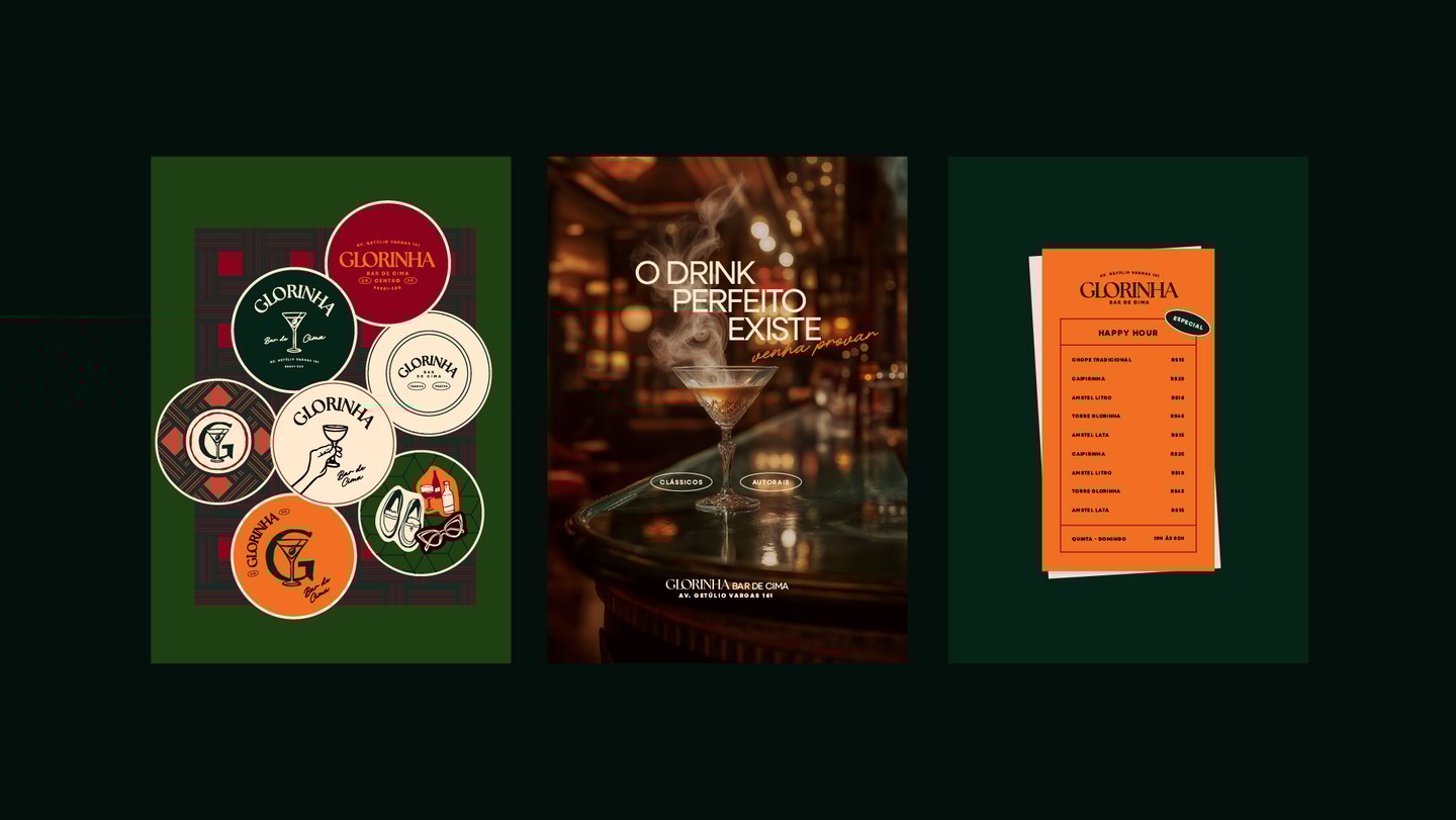
At one point, our design path began to feel overly polished—too refined for a character so spontaneous and raw. So we took a step back, re-evaluated the entire visual narrative, and decided to simplify, refocus, and bring in more human imperfections across the identity system. The logo, for example, carries intentional irregularities and analog charm, echoing Glorinha’s eccentric spirit. These subtle flaws gave the brand more truth, more warmth, and ensured that Glorinha never got lost in the character.
The Visuals
Tell us a little about you and your needs. We'll return to you as soon as possible
Do you want to have a chat or clear your doubts?
Let's talk
Business?
Send us a message